Car Care Plan
A digital application platform for vehicle service contracts. I led the design.
- Client
- AmTrust International
- Industry
- Insurance, B2B and B2C
- Year
- 2022
- Role
- Lead product designer. UX, interaction design, design system
The problem001
Applications were slow and full of errors, and internal teams spent their time fixing them by hand.
Why it was happening002
The errors weren’t the users’ fault. They came from three causes:
01
Nothing checked the input.
Wrong or missing details went straight through to the team.
02
The form assumed insurance knowledge.
Users had to understand the product before they could apply for it.
03
Mobile made both worse.
Small screens and small targets meant more mistakes.
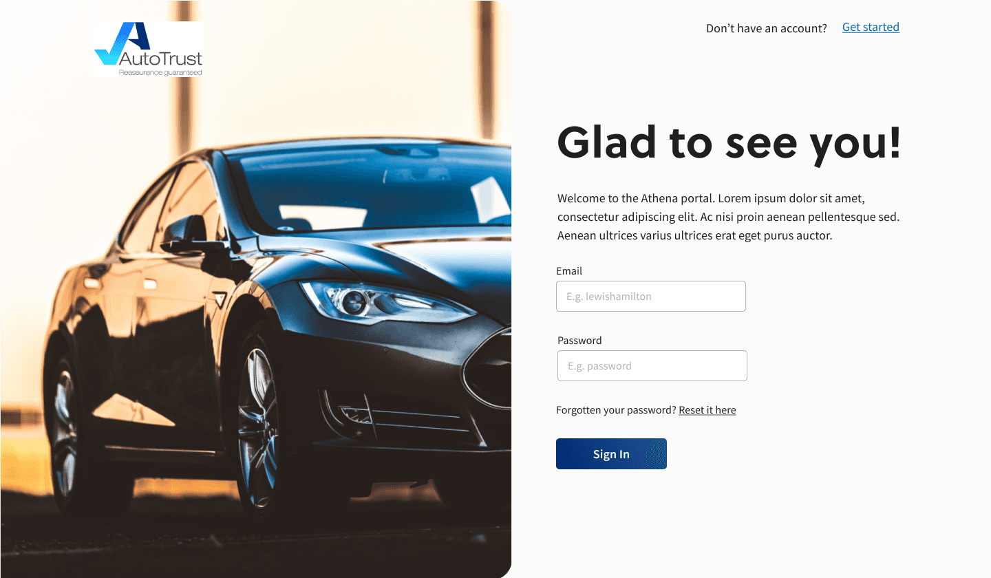
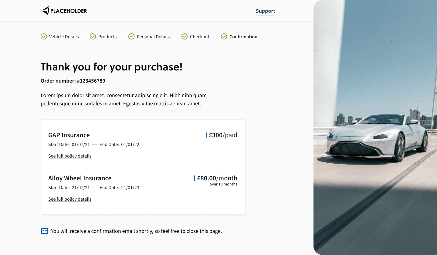
So the fix wasn’t a nicer form. It was to stop errors at the point of entry instead of correcting them afterwards.
What I decided, and why003
01
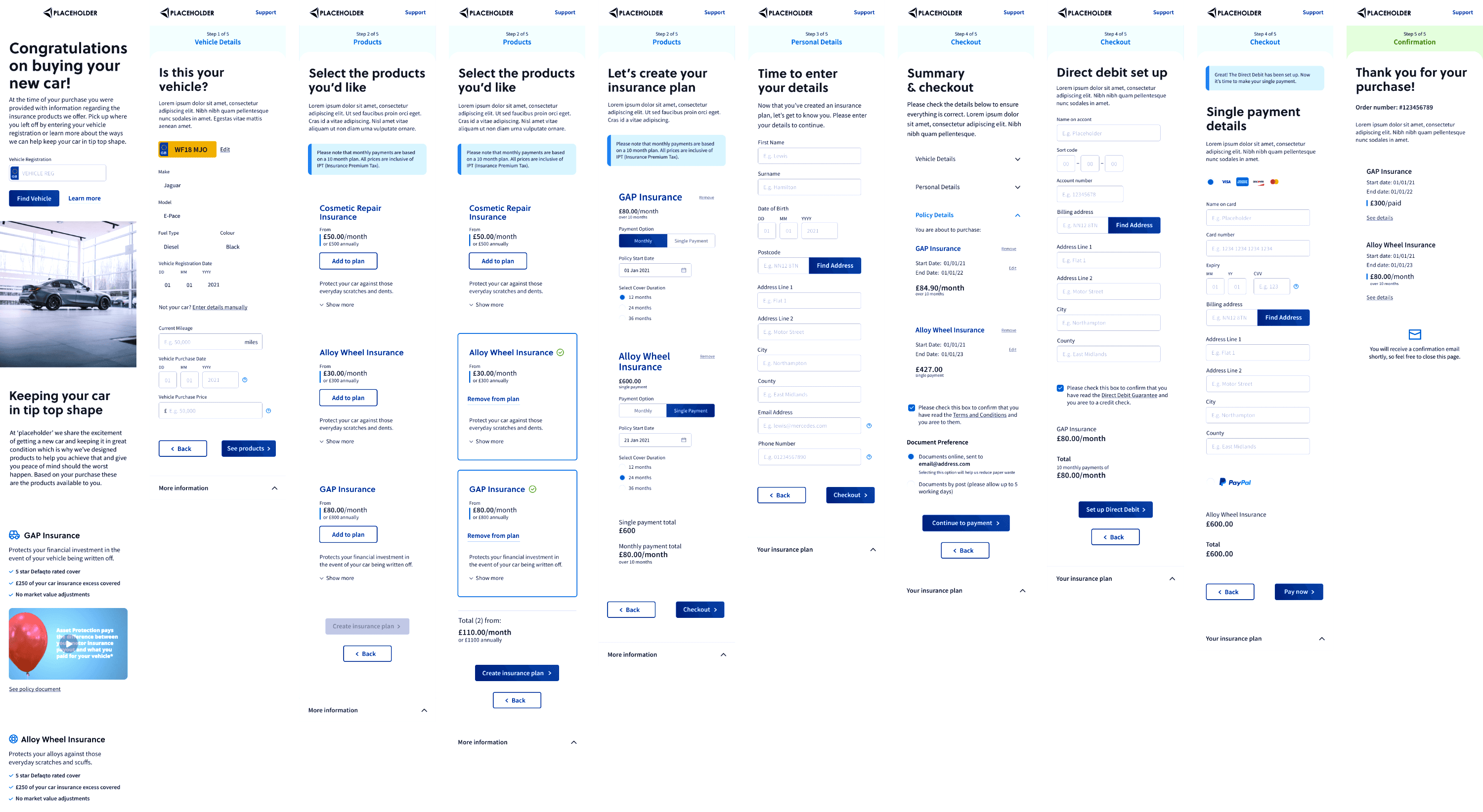
Steps instead of one long form.
Fewer decisions at a time means fewer mistakes, and users can see their progress.
02
Validation as users type.
An error caught in the moment costs the user a second. One caught after submission costs the team a manual review.
03
Plain language and guidance at each step.
Users shouldn’t need insurance knowledge to buy insurance.
04
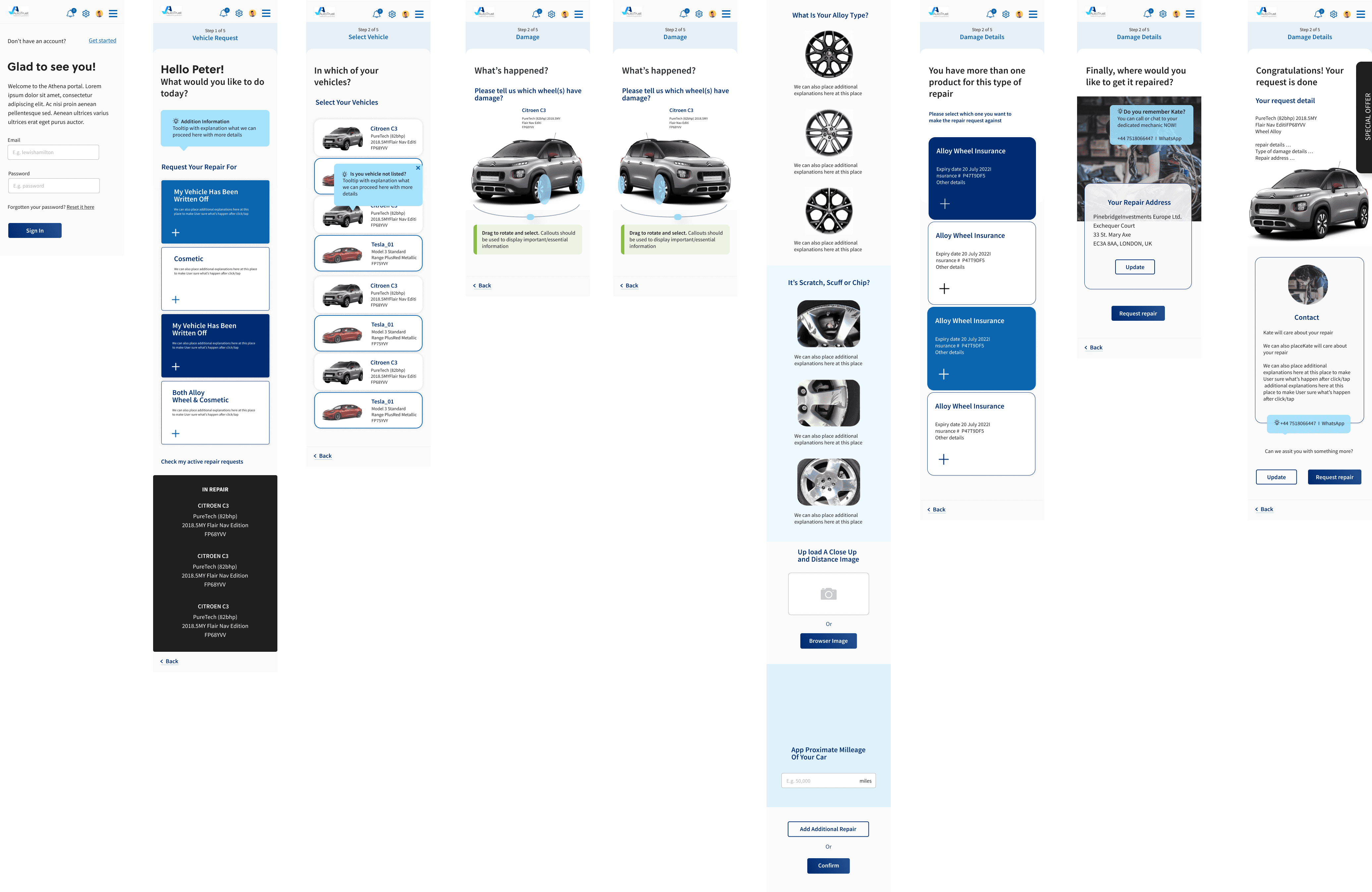
Mobile layout designed first.
It’s the hardest case, so solving it there made desktop simple.
05
A shared component system.
The same patterns everywhere, so the next screen is faster to build and behaves the same way.
The result004
Errors were caught before they reached the team, applications needed fewer manual corrections, and the mobile flow became usable.
What I’d do differently005
I’d agree on metrics before launch: error rate, completion time and manual corrections. The improvement was clear, but I couldn’t put a number on it, and now I always set up measurement first.
Explore projects