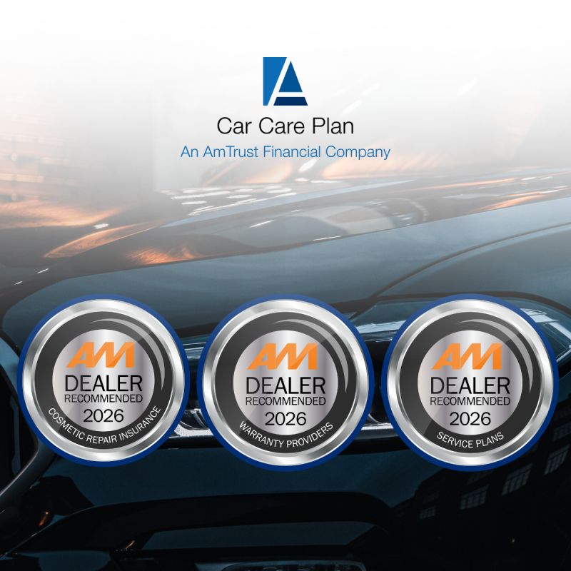


car care plan®
I led the design of a digital insurance platform that transformed a slow, manual application process into a guided, error-resistant system—improving usability, reducing operational friction, and enabling scalable digital processing.
Client
Amtrust International
Industry
Enterprise SaaS / InsurTech
Financial Services / Insurance
Year
2022
Services Provided
Product Design, UX Design, Interaction Design, Design Systems
Overview®
//001
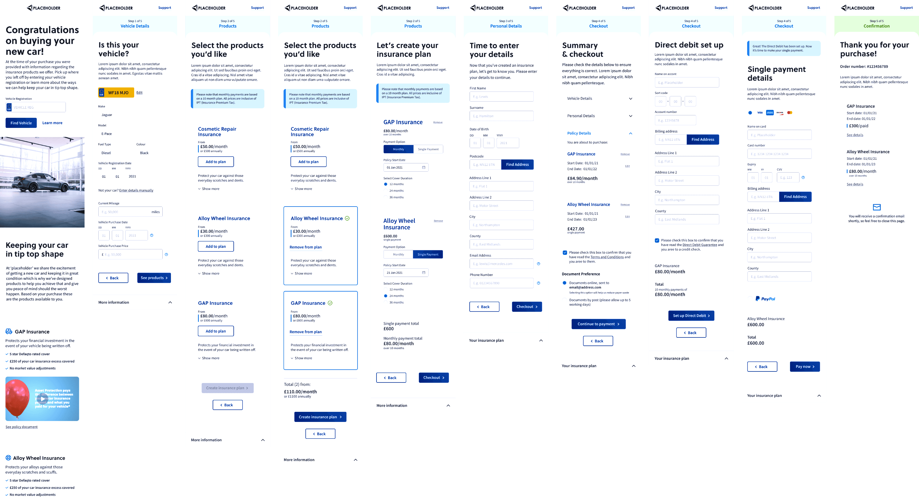
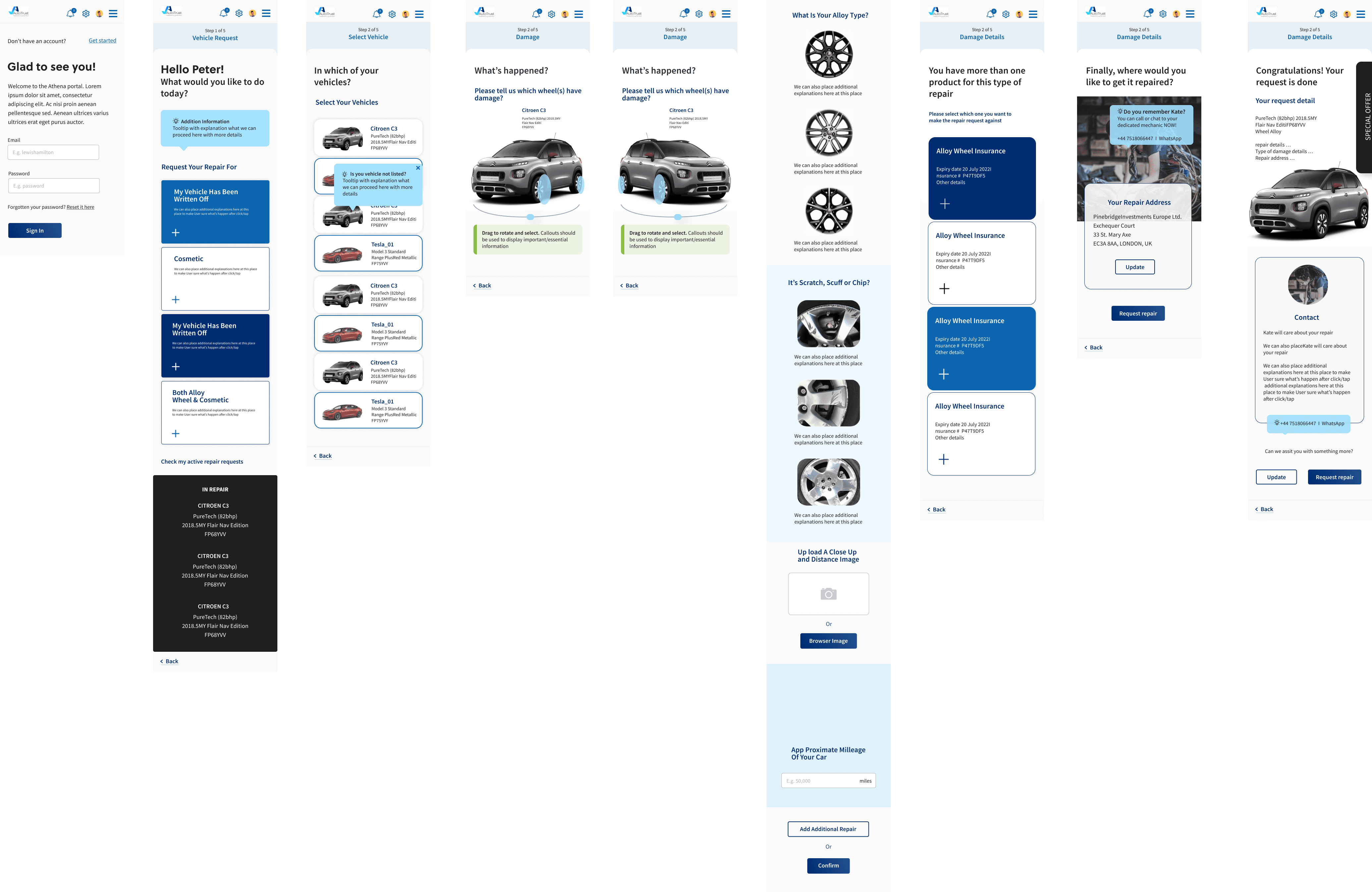
Car Care Plan relied on a manual insurance application process that was slow, error-prone, and inefficient for both customers and internal teams. Users had to complete complex forms without validation, resulting in submission errors, processing delays, and operational overhead.
My role was to lead the design of a digital platform that streamlined the application process, reduced input errors through real-time validation, and provided a clear, accessible experience across desktop and mobile devices.
This required translating a traditionally administrative workflow into a structured, guided, and reliable digital system.
car care plan®
I led the design of a digital insurance platform that transformed a slow, manual application process into a guided, error-resistant system—improving usability, reducing operational friction, and enabling scalable digital processing.
Client
Amtrust International
Industry
Enterprise SaaS / InsurTech
Financial Services / Insurance
Year
2022
Services Provided
Product Design, UX Design, Interaction Design, Design Systems
Overview®
//001
Car Care Plan relied on a manual insurance application process that was slow, error-prone, and inefficient for both customers and internal teams. Users had to complete complex forms without validation, resulting in submission errors, processing delays, and operational overhead.
My role was to lead the design of a digital platform that streamlined the application process, reduced input errors through real-time validation, and provided a clear, accessible experience across desktop and mobile devices.
This required translating a traditionally administrative workflow into a structured, guided, and reliable digital system.

Key Challenges®
//002
The existing application experience created friction at multiple levels
The challenge was not just digitizing the form, but redesigning the experience to actively guide users and prevent errors.
Manual processes increased operational inefficiency
Applications were processed slowly, requiring manual review and correction.
//01
High error rates due to a lack of validation
Users often submitted incomplete or incorrect information, delaying approvals.
//02
Complex workflows were difficult to navigate
The process required users to understand insurance structures without guidance.
//03
Mobile usability was significantly constrained
Small screens amplified usability issues, increasing input errors and friction.
//04

Design Approach®
//003
I approached the problem as a workflow transformation rather than a visual redesign.
The goal was to reduce cognitive load, guide user decisions, and ensure the system prevented errors rather than reacting to them.
My work focused on three key areas
Structuring the application flow
Breaking complex forms into manageable, logical steps to improve completion clarity.
//01
Designing real-time validation and system feedback
Helping users identify and correct issues immediately, reducing failed submissions.
//02
Ensuring mobile usability and accessibility
Optimizing interaction targets, layout hierarchy, and navigation for smaller screens.
//03
Interaction and System Design
//004
The platform was designed to guide users through a structured and predictable process.
Key interaction improvements included:
Step-based workflow architecture
Users progressed through clear, sequential stages, reducing overwhelm.
Real-time validation and system feedback
Errors were identified immediately, preventing failed submissions.
Responsive interaction design
Layouts and interaction targets were optimized across devices.
Reusable component system
Ensuring consistency, scalability, and efficient future development.
This transformed the experience from a passive form into an active, guided workflow.

Final Outcome
//005
The platform enabled stakeholders to monitor product performance, investigate quality issues more efficiently, and make more informed, proactive decisions.
Reduced input errors
Real-time validation prevented incorrect or incomplete submissions.
Improved completion speed
Users could complete applications faster with clearer guidance.
Improved mobile usability
The optimized interaction model reduced friction on smaller devices.
Increased operational efficiency
Insurance providers processed applications faster with fewer manual corrections.
Most importantly, the platform shifted the process from error-prone manual handling to a reliable, scalable digital system.
Final Outcome
//04
The platform enabled stakeholders to monitor product performance, investigate quality issues more efficiently, and make more informed, proactive decisions.
Reduced input errors
Real-time validation prevented incorrect or incomplete submissions.
Improved completion speed
Users could complete applications faster with clearer guidance.
Improved mobile usability
The optimized interaction model reduced friction on smaller devices.
Increased operational efficiency
Insurance providers processed applications faster with fewer manual corrections.
Most importantly, the platform shifted the process from error-prone manual handling to a reliable, scalable digital system.

Explore Projects